

DTF Transfer Color Matching Guide 2026
Editorial TeamQuick Summary
DTF transfer color matching guide: screens emit light while transfers reflect it, so bright colors shift when printed. Build artwork at 300 DPI, calibrate your monitor, run controlled test prints on the actual garment color, and measure results against an agreed tolerance before production.
- Screens mix red, green, and blue light, while printers absorb and reflect light with ink.
- Submit artwork at 300 DPI at the final print size, using PNG files with transparent backgrounds.
- Calibrate your monitor and soft-proof with the printer ICC profile before approving designs.
- Judge color on the actual garment color you plan to sell, not on a white test shirt.
- Agree on an acceptable tolerance with clients, and reject any batch that falls outside it.
Table of Contents
Why DTF Print Colors Look Different From Your Screen
Most DTF color problems start before the film ever leaves the printer. The file looks vibrant on your monitor, the transfer comes off the printer a little duller, and after pressing onto a black tee the design shifts again. That gap is normal, but it is predictable once you understand where it comes from. This DTF transfer color matching guide walks through the causes, the setup steps, and the checks that keep your colors consistent from screen to garment.
Apparel brands, print shops, and independent designers often ask about color, and it is one of the most common questions in DTF printing. The short answer: your screen emits light, while a transfer reflects it. Everything in this guide builds on that difference.
RGB Screen Color vs. CMYK Print Color
Screens mix red, green, and blue light to create color. Printers mix inks on a substrate, and the ink absorbs and reflects light rather than emitting it. That means the two systems cannot reproduce the same range of colors. Bright neon greens and electric blues that glow on a monitor often fall outside what a printer can produce.
Print workflows typically work in CMYK, the cyan, magenta, yellow, and black model, which is closer to how ink behaves. Designing in RGB and converting late is one of the most common sources of disappointing results. Convert early, check the converted file on screen, and expect the printed result to sit slightly inside the screen version.
How Garment Color, Fabric, and Finish Shift Perceived Color
Even a perfectly accurate transfer will look different depending on what it sits on. A transfer pressed onto a heather gray hoodie picks up some of that base tone. Polyester blends reflect light differently than 100% cotton, which can make the same design read more saturated or more muted. A glossy finish or a fabric with a sheen will change how the colors are perceived under store lighting.
For this reason, always judge color on the actual garment color you plan to sell, not on a white test shirt. A test print on the exact blank is the only reliable way to see the true result.
Setting Up Your Artwork for Accurate Color
File preparation determines how much color information survives the trip from your design software to the film. Careless setup creates problems that no printer setting can fix later.
Choosing RGB or CMYK for DTF Artwork
Build and edit your artwork in the color mode your design software supports best, but check it in the output mode before you submit. If you design in RGB, convert a copy to CMYK in your editor and compare the two side by side. Bright colors that shift dramatically in the conversion are the ones most likely to disappoint in print, so adjust them before submitting rather than after.
Resolution, File Format, and Color Profiles
Submit artwork at 300 DPI at the final print size. Lower resolution produces soft edges and blended colors that look muddy after pressing. Use PNG files with a transparent background so the design does not carry an unwanted box around it.
Embed the color profile in your file and keep it consistent across every design in a batch. Mixing files saved with different profiles is a quick way to create visible color differences between otherwise identical sheets.
DTF Printer Color Calibration Step by Step
Calibration is what turns color matching from guesswork into a repeatable process. The goal is to make your screen, your file, and your printer agree as closely as possible, then verify the result with controlled test prints.
Monitor Calibration and ICC Profiles
Start with the screen you use for design approval. Calibrate it with a hardware colorimeter if you can, or at minimum use your operating system's built-in calibration tool, and set a consistent brightness level. An uncalibrated monitor can be off by a wide margin, which means every decision you make on it is built on a distorted view.
ICC profiles describe how a given device reproduces color. A printer profile tells your software how that specific printer, with its specific inks and film, will render colors. Ask your print provider which profile they use, or request a printer profile for your own setup. Soft-proofing your artwork with the correct profile shows you a much closer preview of the final print before you spend money on it.
Controlled Test Prints and Printer Settings
A controlled test print is a small sheet containing swatches of your key colors, labeled, printed on the same film and substrate you will use in production. Test transfers before production to see how they match before committing to a full run. Change only one variable per test so you can identify what caused any shift.
Once you have a setting that works, keep it documented and avoid changing it without a new test.
Building and Using a DTF Transfer Color Chart
A transfer color chart is a reference sheet that maps the colors you print to their values in your design software. Keep the chart near your press so you can compare the finished transfer against known references.
Update the chart whenever you change inks, film, or printer profiles. A chart that no longer matches your current setup is worse than no chart, because it gives false confidence.
DTF Color Matching to Garments and Pantone Spot Colors
Matching a design to a garment is harder than matching it to a chart, because the substrate changes the result. Matching to a specific brand color, such as a Pantone spot color, adds another layer of difficulty.
Matching Garment Colors and Realistic Tolerances
Set expectations before the job starts. A printed transfer will not match a Pantone chip exactly, and it will not reproduce a fluorescent color that the process cannot achieve. Agree on an acceptable tolerance with the client, then measure against it. For most apparel work, a close visual match under standard lighting is the practical target, with a clear note about any colors that fall outside the printable range.
When the client needs a specific Pantone color, ask for the closest achievable CMYK equivalent and show a test print next to the physical swatch. This turns a vague request into an approved, documented result.
Measuring Color Difference After Pressing
Visual checks are useful, but a measurable reference keeps decisions consistent. A spectrophotometer or colorimeter reports color difference as a numeric value, which lets you compare batches objectively. Set a tolerance you can defend and reject or reprint anything outside it.
It is less precise, but it still catches obvious drift.
Checking Color Durability After Washing and Batch Consistency
Color that looks right on the press can still shift after washing. Watch for fading, dulling, or cracking, and record the results with the film, ink, and press settings used.
Batch consistency matters just as much. When a customer reorders months later, the log lets you reproduce the original result rather than guessing. Consistent records are the difference between a repeat order that matches and one that drifts.
Ordering Your Next Color-Matched Gang Sheet from DTF 2 Print
Once your files and calibration are in place, the next step is production. If a transfer has already come out misaligned or badly pressed, learn how to remove and fix it before it reaches the customer. Gang sheets let you place several designs on one sheet, which reduces waste and cost. Start by choosing the transfer size that fits your project. DTF Transfer By Size lets you order by the dimensions you need, from small logos to full-front designs, with no minimum order.

When you are ready to build your layout, Build Your DTF Gang Sheet gives you a builder for arranging multiple designs on one sheet. If you already have a finished, print-ready file, Upload Your DTF Gang Sheet lets you send it directly for production.


Frequently Asked Questions
Why do my DTF colors look darker than on my screen?
Screens emit light while transfers reflect it, so bright colors often print slightly darker and less saturated. Calibrating your monitor and soft-proofing with the printer profile narrows the gap.
How do I match a DTF print to a Pantone color?
Ask for the closest achievable CMYK equivalent, run a test print on the same blank garment, and compare it to the physical swatch under standard lighting. Agree on a tolerance before production.
Do I need an ICC profile for DTF printing?
A printer profile improves color accuracy by describing how your specific printer, ink, and film reproduce color. Ask your print provider which profile they use or request one for your setup.
Why does color change after washing?
Ink, film, and heat press settings all affect durability. Wash test samples according to the care label and compare them to the original to catch fading or dulling early.
Frequently Asked Questions
How do you match DTF transfer colors to a specific garment?
Start by identifying the garment's base color, since a dark shirt will tint the transfer unless the print includes a white underbase. Print a small test transfer on the same blank you plan to use, press it, and compare it side by side under the same lighting as your reference. Adjust the artwork's saturation and brightness, then retest.
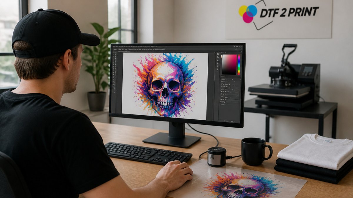
Why do DTF transfer colors look different from the colors on my screen?
Screens display light using RGB, while printed transfers reflect light from inks. Screen brightness, color temperature, and uncalibrated profiles all shift how the design appears. Colors that look vivid on a backlit display can print duller, especially bright greens and deep purples. Calibrating your monitor narrows this gap. Always judge the final color on a pressed transfer, not on the screen.
Should DTF artwork use RGB or CMYK?
Mixing color conversion steps is a common source of unexpected shifts, so keep your workflow consistent across designs.
How do you calibrate a DTF printer for consistent color?
Consistency across batches depends more on repeating the same profile and conditions than on any single perfect print.
How can I test DTF color accuracy before printing a large order?
Press a small test on the same garment blank you will use for the production run, then compare the pressed result to your reference under consistent lighting. If the shift is outside your tolerance, adjust the artwork and retest before committing to a full order.
